773: University Website
Explanation[edit]
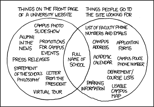
This comic uses a Venn diagram to point out that there is often a significant disparity between what a university displays on the front page of its website and what users — particularly prospective students — are primarily interested in finding there.
This is often because those who are making the university website instinctively believe, from their perspective, that the website should contain things that the university is proud of, or that they personally find useful, so they are unable to look at it from the perspective of a person who is new on campus and simply wants to know what number to call for campus security. Thus, simple details like contact information and university data are often overlooked.
The title text presents a satirical response from the school defending their site design, consisting mostly of PR worthy of an alumni magazine (a publication that is seldom anticipated so eagerly). It also uses sarcasm to make fun of university websites that have wildly out of date site design (web technology was relatively primitive in 2001)[citation needed] and a CS (Computer Science) student built it instead of a professional.
Transcript[edit]
- [A Venn diagram.]
- [The left circle is labeled "Things on the front page of a university website" and contains:]
- "campus photo slideshow"
- "alumni in the news"
- "promotions for campus events"
- "press releases"
- "statement of the school's philosophy"
- "letter from the president"
- "virtual tour"
- [The right circle is labeled "Things people go to the site looking for" and contains:]
- "list of faculty phone numbers and emails"
- "campus address"
- "application forms"
- "academic calendar"
- "campus police phone number"
- "department course lists"
- "parking information"
- "usable campus map"
- [The only item in the overlapping section is:]
- "full name of school"
Trivia[edit]
- Some university administrators reportedly took this cartoon to heart. For further discussion of this cartoon, see Inside Higher Ed, DylanWilbanks.com, and .eduGuru.
- The University of Arizona created an unofficial page at http://at.arizona.edu to become compliant to this comic and also links to xkcd. Try to find all that information at their official home page at http://www.arizona.edu.
Discussion
Randall is exactly right. Online campus maps can be really annoying. Check out http://map.yale.edu/map/ for an example. They're usually impossible to read on a phone because "click to zoom" is impossible. I'd much prefer a simple pdf or image that I can pan/zoom how I like. 198.41.235.179 16:40, 9 July 2015 (UTC)

