Design of xkcd.com
Revision as of 17:48, 3 July 2023 by 172.70.162.244 (talk) (→Comic: Tweaks of many little kinds, all because I decided to improve some grammar. And I forget *which* hit of grammar, now, so I don't even know if I've done that (or made it moot!))
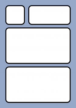
The four segments on xkcd.com
- The front page consists of four segments.
- They are all white areas split apart from each other with a light blue-gray background color showing up in between them.
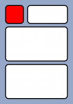
- The first segment:
- xkcd links:
- It is the square one. It is at the top left of the page, with just a thin line of the background showing above it and below it and to its right.
- It contains links to other pages on xkcd see below.
- xkcd links:
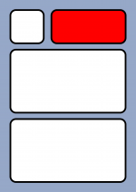
- The second segment:
- Header
- This has the same height as the first segment but takes up a thin rectangle making those two first segments have the same total width from left to right as the two segments below. And the lines around it where the background can be seen is as in the previous segment.
- On a broad computer screen at full resolution and 100% zoom there will be broad bands of the background on each side of these centered segments.
- In this segment are the following items (see below for more on these)
- The logo of xkcd to the left. (The logo image is a link to xkcd.com and will take you to the front page from other comics).
- Next to the logo to the right is the comics tagline.
- And below these two there will be a changing message, the header text.
- Header
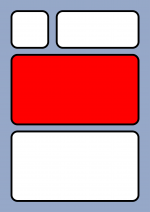
- The third segment:
- Main comic
- This is the main segment where the comics are. On the front page, the newest comic will always be displayed.
- This is therefore changing, typically three times a week, but these changes are not considered a change to the front page design.
- This segment is as broad as the two above together and as broad as the one below it has a rectangular shape most of the time but shapes itself after the height of the comic.
- So, it can be very short like here 1123: The Universal Label and very long for instances like here with 1732: Earth Temperature Timeline.
- See more below.
- Around the entire segment there is a thin line where the background can be seen.
- Main comic
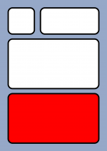
- The fourth segment:
- Bottom segment
- This is the final segment below the main comic segment. It is just as wide as that above but has a fixed dimension.
- The first is a line of five Footer comics. These can change over time, see below.
- It changed so a sixth footer comic is now displayed below the other five in one wide image as broad as the other five.
- Beneath is a link to two feeds.
- Beneath these is a list Comics I enjoy
- Beneath these is a list Other things
- Beneath these there is a footnote.
- Previously there also been a warning, but this has been removed and the footnote changed shortly thereafter.
- See Warning and footnote
- Finally, there is the License and copyright statements at the very bottom.
- Beneath that there is an empty white part and then the bottom of the page is reached.
- Only the shadow of this last segments edge can be seen at the bottom, the background color is not visible below.
- Bottom segment
Changes over time
- The design has changed many times but mainly in the beginning.
- Below here is only meant to be a list of huge changes to the entire page.
- Preferably only changes that can be documented with a web archive link should be used.
- Give a date (in the correct format as shown in 1340: Unique Date) of the link first and sort after newest at the top:
- 2006-07-10
- This was the first time that a design close to the current was used.
- 126: Red Spiders Cometh was up at the time.
- This was the first time that a design close to the current was used.
- 2006-02-07
- This was how the web site looked after Randall had closed down for LiveJournal releases the week before on January 30th, 2006 (with the release of 56: The Cure). The link is to the first copy on the web archive after that happened, and it was saved the day after 60: Super Bowl was released.
- 2006-01-09
- This was how the web sited looked three days after the second comic, 46: Secrets, was released simultaneously on both LiveJournal and xkcd. The page was saved on the 9th of January 2006, before that day's comic (47: Counter-Red Spiders) had been released. Randall had taken a long break from xkcd since and had just begun posting again on both sites from January 4th, 2006, with 45: Schrodinger.
- The 41 comics released earlier throughout 2005 was at that time all included on the xkcd page as if they had been inserted on New Years Day (2006-01-01).
- Thus disregarding that, they had almost only been released using the still going Monday, Wednesday, Friday schedule from September 30th 2005, with the first being 7: Girl sleeping and the last being 39: Bowl released on December 5th 2005. Thus, he took 30 days without a release from there and had released.
- And as would be clear he also disregarded the order as the first is now 1: Barrel - Part 1 (which was though released the same day as the Girl, but still only as number 3), and the last number of those 41 comics is now 44: Love, which thus also shows that three other comics have been inserted among the first 44 to make the first xkcd release number 45.
- This was how the web sited looked three days after the second comic, 46: Secrets, was released simultaneously on both LiveJournal and xkcd. The page was saved on the 9th of January 2006, before that day's comic (47: Counter-Red Spiders) had been released. Randall had taken a long break from xkcd since and had just begun posting again on both sites from January 4th, 2006, with 45: Schrodinger.
Links
- For more information, visit the main article.
These are the links at the top left of the page to navigate around on xkcd.com:
Header
- For more information, visit the main article.
- The header consists of:
- The logo:
- The four letters x k c and d are there in a gray blue color in front/on top of a faded-out drawing in similar color:
- A table with a shining old and big computer screen is behind the x, the rest of the table and an office chair at the end of the table behind the k, a guy with thin dark hair (resembling an early version of Hairy) behind the c and finally Black Hat behind the d. The two are facing each other, so Hairy has his back to the table. The line in the d goes straight up through the stick figure body of Black Hat ending in his round head just below the Black Hat.
- The tagline of the comic is next to the logo It is in two lines that says:
- A webcomic of romance,
- sarcasm, math, and language.
- See the warning (which now is gone from xkcd pages).
- Beneath all this there is some kind of message the header text which may change over time.
- The go to header text is: xkcd updates every Monday, Wednesday, and Friday.
- But the current header text may be different.
- See main article: header text.
- The logo:
Comic
- This is where the comics are displayed.
- Above the comic is the title, in large bold letters.
- As always Randall uses a small caps font. By copying text to another program without preserving the font format, it shows both capital and lowercase characters.
- Below the title and above the main comic image there is a row of buttons. These are fairly standard:
- The two outermost "to the limit" arrows, |< or >|, take the user to either the very first or the most recent comic.
- Next to those are the < Previous and the Next > buttons, taking the user to the two adjacent comics to the one currently displayed.
- In the middle is the Random button comic which chooses a random comic.
- If the user is on the main page, the two rightwards-pointing buttons will not do anything as there are no newer comics than the one displayed already.
- Similarly, explicitly visiting the first or latest comics removes the utility of the respective directional choices.
- These buttons are repeated below the comic. For smaller comics this is not so relevant, but for taller comics this ensures the buttons are at hand both before and after any scrolling down that may have heen required.
- Finally, beneath the second row of bottoms there are two links.
- The first is a permalink to the current comic displayed on the page.
- Permalink is also used in some of xkcd's interactive comics see the permalink section on 1350: Lorenz.
- The link is just the xkcd server address with the number of the comic. So, for the comic 1791: Telescopes: Refractor vs Reflector, the link would just be:
- The other link is:
- The image URL (for hotlinking/embedding):
- http://imgs.xkcd.com/comics/telescopes_refractor_vs_reflector.png
- Here the link is also on xkcd, but indicates that it is stored within a comics-specific logical subdirectory of the server, with individual filenames often in line with the comic title (though there are exceptions, especially where title clashes occur or the visible comic is actually a dynamic/composite rendering) plus the extension for the image-type, which is often .png but may be .gif or otherwise in some instances.
- Above the comic is the title, in large bold letters.
Bottom segment
- An image can be found here on the footer comics page.
- Five footer comics has been used at the bottom of xkcd almost from the beginning after only xkcd.com was used to post comics.
- They are likely selected to give a broad specter of the content and most likely are to some of Randall's own favorites (or users favorites).
- They have changed at least twice since the first was used back in February 2006 before they changed a third time to the current five comics in August 2010.
- They changed for the fourth time on 1 March 2019 to the present version with Earth Temperature Timeline in addition to the five previous comics.
Feeds
- There are links to two xkcd feeds below the footer comics. And on 2019-02-06 also a link to Email, where it is possible to subscribe for news, was added.
- RSS Feed
- Atom Feed
- Email
- The two last links have later, on 2019-06-11, been added to the links at the top.
- Before, from 2019-02-05, only the two feeds were added here.
Comics I enjoy
- Beneath the two feeds there is a list of Randall's favorite webcomics with links
- Comics I enjoy:
- Three Word Phrase
- SMBC
- Dinosaur Comics
- Oglaf (nsfw)
- A Softer World
- Buttersafe
- Perry Bible Fellowship
- Questionable Content
- Buttercup Festival
- Homestuck (redirect no longer functional, should lead here)
- Junior Scientist Power Hour
Other things
- Beneath the web comic links is another section of external writings.
- Since 2019-02-26 there have been three links under the text "Other things:"
- Tips on technology and government
- Climate FAQ
- Katharine Hayhoe
- The two bottom links replaced the two original links from when this section began.
- On 2017-07-15 a third link was added to the two original:
- Women Also Know Stuff
- Tech Solidarity
- Tips on technology and government
- The two original links was removed in favor of two other links after 2019-02-25.
- The new link then moved to the top.
- On 2017-03-21 this section became part of xkcd with two links:
- Women Also Know Stuff
- Tech Solidarity
- There where only two links until 2017-07-14. The day after a third link was added.
- Up until 2017-03-20 this section was not a part of the xkcd design.
Warning
- For more information, visit the main article.
The warning on xkcd was originally added to the site in 2006, but it was removed in 2016. It stated:
- Warning: this comic occasionally contains strong language (which may be unsuitable for children), unusual humor (which may be unsuitable for adults), and advanced mathematics (which may be unsuitable for liberal-arts majors).
Footnote
- For more information, visit the main article.
The footnote on xkcd is written in a very tiny font, which makes it very hard to read without zooming in. There have been two major footnotes displayed over the course of the site's history, with the current one being added in 2016. It states:
- xkcd.com is best viewed with Netscape Navigator 4.0 or below on a Pentium 3±1 emulated in Javascript on an Apple IIGS
- at a screen resolution of 1024x1. Please enable your ad blockers, disable high-heat drying, and remove your device
- from Airplane Mode and set it to Boat Mode. For security reasons, please leave caps lock on while browsing.
License and copyright
- Randall allows people to use his comics for free as long as they do not make money on them and as long as they credit him with the work.
- There are two notes:
- This work is licensed under a Creative Commons Attribution-NonCommercial 2.5 License.
- This means you're free to copy and share these comics (but not to sell them). More details.
- The last link is to a link on xkcd.
