2864: Compact Graphs
| Compact Graphs |
 Title text: People may complain about readability, but even with jpeg compression, extracting the data points is usually computationally feasible if there aren't too many of them. |
Explanation
| |
This explanation may be incomplete or incorrect: Created by HUGH LABEL, PROTECTOR OF THE COLOR REALM - Please change this comment when editing this page. Do NOT delete this tag too soon. If you can address this issue, please edit the page! Thanks. |
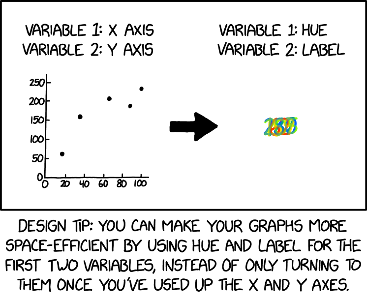
This comic is another one of Randall's Tips. In it, he tells graphic designers they can be more space-efficient by using hue (an element of color) and label in their graphs to represent the first two dimensions of a dataset rather than what's traditional: using x and y axes and then using hue and label to represent additional dimensions (such as the z-axis).
In this comic's hue-label graph, the x-axis dimension is (mostly) translated into corresponding hue value, and the y-axis dimesnion is translated into text labels; that is, the mass of colorful lines is actually several numbers written in the same spot. Each number is one of the y-coordinates of a point in the left graph, and its color (usually) corresponds to its x-coordinate using the Hue, Saturation, Value (HSV) model. In other words, the colors are not arbitrary; each color represents a dimension of the data point as a Hue value from 0 to 100 in the HSV color model.

In the HSV color model, the hue component represents the color type and is expressed as an angle on the color wheel, where 0 degrees is red. The hue values are given in degrees, ranging from 0 to 360. Each value corresponds to a position on the color wheel, defining a specific color. When used like this to represent specific quantities, the Hue dimension can only handle values from 0 to 360, and values within a narrow range (e.g., height of a basketball team's players as measured in inches) would all appear to be similar colors.
This Hue-Label graph contains the five data points as an orangish-red 62, a yellow 159, a green 205, a turquoise 187 and a blue 230.
- The red 62 corresponds to an x-value of approx. 157, a hue value corresponding to a shade of warm red.
- The yellow 159 corresponds to an x-value of approx. 36, in the range that typically represents warm yellow.
- The green 205 corresponds to an x-value of approx. 67, a hue value for yellowish green.
- The turquoise 187: 187 is near the hue value for turquoise, between green and blue in the color wheel. (This data point's x-axis value of 85 would be yellowish green.)
- The blue 230: 230 is the hue value for a clear, distinct blue. (This data point's x-axis value of 100 would be warm green.)
Interestingly, the first three data points have hue colors representing their x-axis values, while the last two data points' colors correspond to their y-axis values.
This inconsistency may be a mistake on Randall's part, or it may be intentional. Randall's intent may have been to keep the x-axis values of his illustration between 0 and 100 (perhaps they represent real-world percentages) while having a range of colors across the rainbow for the Hue-Label graph. Either way, the inconsistency satirically reinforces how limited this type of graph style actually is.
An hypothetical example of a potential topic for these 5 datapoints is Exercise Duration vs. Calorie Burn. In this scenario, on the x-axis, the duration of exercise in minutes (0 to 100) would be plotted, and the y-axis would show the calories burned (0 to 200). The longer the exercise duration, the more calories are burned, but the graph shows it's not a perfect correlation. Many other scenarios are possible, and the true scenario may be related to whatever What If? video script Randall is currently writing; at the time of this comic, he had just published his first two What If? videos to YouTube and said he was working on more of them.
The title text mentions that people may complain about readability, as is evident from the jumbled mess of seemingly meaningless lines in the hue and label graph in the comic. It says that discerning the data points is "computationally feasible, as long as there aren't too many of them". The decryption of information being labelled as "computationally feasible" implies that it is so difficult to discern, that the best thing that can be said about it is that it is not completely impossible.
Trivia: Hue is commonly used to represent a proportional dimension in geospatial analytics, such as relative rainfall on meteorological maps or relative height on topographical maps (hypsometric tints), usually with a key. This is quite different than using hue to directly represent a numerical value from 0 to 360.

A color scale graph was previously the source of a joke in 2537: Painbow Award.
Transcript
| |
This transcript is incomplete. Please help editing it! Thanks. |
- [Left: graph of points plotted along two axes, headered by:]
- Variable 1: X Axis
- Variable 2: Y Axis
- [An arrow pointing to the right.]
- [Right: various semi-transparent numbers in different colors stacked on top of each other, headered by:]
- Variable 1: Hue
- Variable 2: Label
- [Caption below the panel:]
- Design tip: You can make your graphs more space-efficient by using hue and label for the first two variables, instead of only turning to them once you’ve used up the X and Y axes.
Discussion
Suggestion for X-axis: red - yellow - green - blue (like visible light spectral colours, but in reverse direction)
Suggestion for y-axis: 62 (red) - 159 (yellow) - 187 (blue) - 205 (green) - 230 (blue)
--172.71.246.52 21:35, 6 December 2023 (UTC)
If the second "graph" really is a representation of the same data as the first, there should be five points, corresponding to (approximately) {(17, 62), (36, 159), (67, 206), (88, 186), (100, 232)}. I copied the first plot to GIMP, cropped it, scaled it to 100x250, and measured the centres of the dots. :-) BunsenH (talk) 02:19, 7 December 2023 (UTC)
I agree with five labels. Combining these information above so far, and adding information from the Color Model HSV (also extracted with GIMP, from the large file :-)
17, 62, hue 13 (red, HEX ff3a00)
36, 159, hue 51 (yellow, HEX ffdb0f)
67, 205, hue 87 (green, HEX 8afc03)
88, 187, hue 169 (turquoise, HEX 08a387)
100, 230, hue 217 (blue, HEX 0060ff)
Does anyone find a consistent/proportional correlation between x-axis and HSV-hue? If not, it makes not much sense to mention the x-axis values in the explanation.
--LaVe (talk) 07:53, 7 December 2023 (UTC)
- Sorta! It lines up with the x values for 3 of them and the y values for 2 of them, which is unlikely to be a pure coincidence. Attempted to explain all this in my edits just now. Laser813 (talk) 20:32, 7 December 2023 (UTC)
Should we link to 2537: Painbow Award Kvarts314 (talk) 10:43, 7 December 2023 (UTC)
I think we're still missing the joke. In graph theory, there's a number of important problems and theorems related to colouring and to compact graphs (although I don't think many problems involve both concepts). Someone better versed in graph theory should chime in. 172.69.214.109 15:27, 7 December 2023 (UTC)
- I personally don't think it goes that deep, but I'm not a graph theory expert. Laser813 (talk) 20:32, 7 December 2023 (UTC)
Perhaps someone better at graphics than me could create a "key" for the Hue-Label graph, showing how the colors from 0 to 360 hue correspond to numbers? Laser813 (talk) 20:32, 7 December 2023 (UTC)
